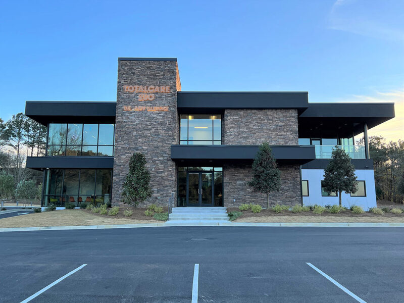
We were commissioned to design a high volume primary care medical office, which also includes a physical therapy suite, for a growing medical practice. The owner had a very strict budget of $190.00/ s.f., which is significantly lower than the current market rate for medical office buildings. To meet this budget, we designed the main body of the building as a square, giving us the most floor area with the least amount of perimeter. We also employed simple square windows and EIFS system for the building skin on the South, East, and West sides of the building.
Because of the tight budget and orientation of the building on the site, the North elevation became the heart and soul of the building. The building needed to look interesting and inviting from the street, as well as warm, light-filled, and comfortable on the interior. The use of a limited amount of stone and a generous amount of glazing on this North façade gives the entrance a distinctive look while also bringing natural light and nice views into some critical spaces. The building is situated near the crest of a small hill, with nice view to the Northeast and Northwest, so spaces that would enjoy the view the most were placed in those areas. These spaces are the kid’s portion of the Waiting Area, the Infusion Room (people getting infusions sit in this room for several hours at a time), the main therapy room in the Physical Therapy Suite, and the doctor’s private office suite. Large roof overhangs on the Northeast and Northwest corners help shield the morning and afternoon sun without needing shades that obstruct the view.
The medical office space itself was designed for a high volume of patients, with patient flow being of primary importance. Patient entrance and exit from Waiting Room to the exam/ treatment areas are separated, with the Nurse Station and diagnostic areas in the center of this route.
The design achieves an exciting, interesting façade and inviting, friendly spaces for a high-volume, low-budget facility.


